Tuesday, 17 May 2011

Hunter Gatherer : Dinu Li

Chosen artist:
Dinu Li is exhibiting a display cabinet that was originally discovered standing defiantly upright, yet alone inside Chester Market. Upon the end of its tenure, the marketer had stripped his stall bare, leaving behind the cabinet that makes up the front façade.There is a formal quality to the cabinet, constructed as four separate display components, forming a complete hexagonal unit when all four parts are joined up. The emptied out glass display alludes to a range of existential concerns; conjuring up notions of our need to possess and to show off our assets, yet the potential lack of contentment once we have obtained the things we most desire. 


  Exhibition area / space / object:
I went to the Hunter Gatherer exhibition at Project Space Leeds.
I saw a Chinese shop - I knew that the piece was from a market space in Chester and that if anything was Chinese about it, it would be that it sold chinese things like tea.
There was tape laid out on the floor which gave the impression of a shop space and that a one point there would have been glass walls there.

It was really dirty – it looked old and dusty not like you expect a shop to be – abandoned and empty like it had be robbed of all the stock a long time ago.
I understand that the artist took the whole thing – the loose objects in the cabinet – everything - and moved it to the exhibition in Leeds.
It gives people viewing the piece the opportunity to use their imagination – to imagine what might have been once upon a time.

What do you think it represents?
A small shop – not a chain of stores – owned by one person – I think it represents a business woman selling clothing, tea cups, spoons all things Chinese – very posh – individual – unique.
Why do you think it was chosen?
Because it interested the artist – perhaps he found it was old and strange and he found it really interesting, intreging. And that there is a connection to his life in Hong Kong because the word ‘CHINA’ is in silver on the cabinet tops.
 What is it’s relationship to the other objects?
I think that this piece links to the other objects in the exhibition in a way that the artists find objects but then add and arrange them with other, extra new things to make the art exhibit.
There were some glass objects that I could imagine as things that might be sold there.
Like and dislike?
I like the combination of black and silver, I liked the reflective quality of the chrome frame and the sparkley  stenciled letters too.
Even though it is old it gave me a feeling of the future too. Something robotic – I felt inspired by it – it made me want to make futuristic clothes, wear futuristic make up and listen to robotic music.
I didn’t like that it was so dusty and dirty – it made me sneeze – it made it look poor, from an inpoverished area – you could really wipe your finger through the dirt – it made me cringe.
Maybe it’s a girly thing, but I wanted to clean it all up.

Tuesday, 3 May 2011

East meets West


Sums me up – similar to my style as I like mixing different cultures.


Japan and Manga –
Japan has a wide range of styles and strange clothes and styles.
Japan seems to stand out against the other countries regarding its style. I merged the Japanese Manga and the English Goth.
I liked the Illustrative technique of Manga – the wide eyes and sticking out hair. I chose to use large illustrations of Gothic style Manga characters on an English Gothic style cardigan.

I like black as a colour.

I liked the silk bodices that were Gothic styled so I translated this into the cardigan. So this was also an influence.

I knew I was going to use large illustrations so needed a large area to put them on and this influenced my choice of garment. I was influenced by Gothic dresses which I extended and then some of my research was into period clothing   - the Victorians  and my final design had a Victorian influence. The shape of this cardigan was classic Gothic – long and narrow.
 I added the white belt because a lot of Manga illustrations use black and white.

The collar and cuffs are ribbed and stretchy because I wanted them to be comfortable and allow movement of the wrists. The collar design came from some research into Japanese Goth/ Punk style collars.  I wanted the collar and cuffs to be modern and not old fashioned.

The metal belt comes from an Issey Miyake design which grabbed my attention form a book formIssey Miyake (Fashion Memoir) (Hardcover)
by Laurence Benaim (Author) . It was futuristic and strange.  I liked the fluid movement of the skirt that was with it and this influenced how I wanted my cardigan to feel and look – light and cool.

Vivienne Westwood ‘ punk styles were an influence as they have similarities to the Gothic look. The long platform boots are an influence form Westwood

I don’t like my final designs. I should have done more research. If I had more time I would make the cardigan shorter. I would also add buttons and more detail. I would also change the background colour of the heart so it wasn’t white.


The metal belt comes from an Issey Miyake design which grabbed my attention form a book formIssey Miyake  (Fashion Memoir) (Hardcover)
by Laurence Benaim (Author
http://news.bbc.co.uk/1/hi/england/bradford/7204543.stm
http://media.otakuzone.com/store/user/181253/T130042012575cc6d0b70c5cc97430d18ff3d2e407109.jpg
http://www.amasquerade.com/images/products/pirates_and_18thcentury/FH8715Legacy.jpg

Disable fashion design& disable model

Different Disabilties:-
  • Deaf
  • Amputated
  • Partial parlysis
  • HMPP & ME
  • Down syndrome 
  • mant more.....

Most disable models are disabled from birth. There are also designer who have used disability as an inpiration. Britain next top model is progrome the was ared on living tu and for one series created the first ever campaetion to be aired fot britians top disanled model. Girls thaht took part in the programe are :- Debbie Van der Cuthen, Jenny Johnson, Jessica Kdlyren-hales,kellie Moody, Kelly Knox, Lilli Riner, rebecca tegon and Spohie Morgan. Kelly Knox was the winner of the compatition.
Beauty and the beast is another prograin which was ared on chanel 4 and consentrae of poeple disabilties and the kind of evenyday  discrimnation they feel. Highlighing the first empertion a personm would have about some one with a disabilty and visuersa what one's first expertion wouldbe about someone who maybe beauliful. the progrom's target was to basicallt not to judga the book by it cover. Two poeple were united together, a person with a disabitey and person who in society would be seen as beautiful. they had to go through what the person like is about and experionce it and learn from it. In my opinion both the progran's britian's next top model and beauty and beast are progroms which high light the peoblems that are faced by disable person. they should be in socity as equal th anyone else. they are beauliful and uniaque.

Beauty and the Beast


britian missing top models


Kelly Knox was the winner of the compatition.


Zac Poson Paris fashion week 2011

A look into Zac Poson  Summer and Spring (S/S) collection this year
Some of Zac Poson design for the S/S collection is nice and some were not so nice. He has used some beautiful colours and some that are not so appealing. Some of the design are truly breath taking.  He has used material in all different easy , mainly using net as the main textile at the fashion show in Paris . 
He used some other nice textiles which include:
  • Fur
  •  Silk
  •  Cotton
  •  Jarrett
  •   Jersey
  •   Linen
  •   Tissue
  •                Woolen

     Some of the textiles used in the designs showed the use of a wave affect 

1.    This look uses the wave effect and the idea of bones that go down and around the dress.
The dress and pattern shape is rough and shows very fine detail.
I like the patterns the colour colure and the shape of the design looks very good.


1.    This design does not look as nice because the model’s thin figure is lost in the outfit and the colour conflicts with the models complexion.
The see through silk fabric looks nice with the fine detailed sequence.

I love this dress, it looks very pretty and the use of black, cream and grey mixed up looks lovely on the dress.  I like the way the bust line is designed, with the black used to detail the dress, the light cream and darker cream and grey all together work to look like the form of a wing.

1.    Wow I love this dress it’s colour scheme is very nice but similar to the above dress and also similar to the third dress. The side pleats which are in black are giving a very nice shape to the model’s figure. The  Grey and black colour gives a very elegant Hollywood look.


the look of this dress does not look the nice compared to the others  because I don’t like the fur on legs. I also don’t like the triangular shaped cut out used to show the chest and tummy,however I like the idea as it reminds of something that may have been worn in World war I or II.   


1.    This dress looks like a queens dress, the colour scheme is the same as dress 3 and 4. But dress is more rock and roll and something that would be worn to a party. But and the same time looks posh. I like the buttons and the shape of the dress, with the use of the net textile. And I like way that Zac Poson has used a different colour on the bustline and the on middle, reminding me of the shine and detail of a diamond.


1.    I don’t like the fur on the hip area, it looks like the model is away to fly away. I only like the colour but not the fur and I do not like the trousers and top with the jacket. The shape and patterns of the design , and the net does not work with this outfit.


1.    I like this design; it looks nice with the fur on the dress, and the pink and black with the use of the net textile works very well. It looks like underwear or an outfit for going swimming or to the beach and I like the chest and hip fastener shape and form, and the material and pattern remind me of a wave. 
 http://mode.newslicious.net/2010/09/paris-fashion-week-zac-posen-ss-11.html

Tuesday, 15 March 2011

Jeans – Denim

Jeans – Denim

Denim was made 18th century

1853 Levi Strauss came from Germany – moved to America – tried to sell wagon covers but somebody told him to do trousers – thought he needed to do jeans – complained that they chafed – changed to cotton – used Denim

Originally worn as work wear – chosen because tough and strong.  Have changed their meaning and purpose over the years.

Jean styles have changed over the years – worn by lots of different groups of people:
40s and 50s – drainpipes
Rockabilly  - James Dean – 1950s
60s and 70s – flares
Motorbikers – mods – hippies -  different styles – colours
80s – slashed jeans and stone washed jeans.

Now
Warm and comfortable
Different designs
Suit your body shape
Widely available – different styles – some ripped, sparkley etc
Everyone wears jeans
They look good
They are hard wearing
 The Denim uesd to be only BLUE now  Denim jeans can be multi coloured black, red .green, white and black. .

connotation
When you wouldn’t wear jeans: smart office , older people, school– because they have to look smart.
Jeans are seen as relaxed and clothing for young people
people wearing jeans would be more approachable. 
Examples of 50s style jeans
 Vote [+1]
the womans who have a 50 style jeans at 50's. she a have a eat at burger  it look a style.
red Pop blouse - blue Zara jeans - red vintage scarf

http://theselvedgeyard.files.wordpress.com/2010/07/james-dean-giant-lee-jeans.jpg
the a James Dean at who a first make his a jean in a 1925  87years age.

Examples of 60s style jeans
  
 The  60's way a hippy at  they have a different waya jeans


70s denim The History Of The Wonderful Fabric, Denim!


http://www.masks-wigs-and-costumes.com/Halloween/images/blue_jean_hippies.jpg

Examples of 70s style jeans

The way a 70's a .flares at a it just bit like a hippy  at more comfortable.


flaredjeans Jeans Go Back to the 70s   Nexts new kickflares


Mods and Rockers in jeans
The MODS AND ROCKERS  are Enemies  that way at  style jeans .
File:Chelsea-Bridge-Rockers.jpg
  
 Classic 80s style jeans
The 80's at style  torn, bleahed, stonewashed  that way a style jeans.#


*
*


http://www.denimblog.com/category/history-of-denim-brands/                                                                                                        


http://wapedia.mobi/en/Rocker_%28subculture%29


http://theselvedgeyard.wordpress.com/2010/07/26/tsy-style-hall-of-fame-james-dean-cultural-giant-of-the-rebel-set/

http://www.denimology.com/2007/02/lips_jeans_retro_with_style.php


Tuesday, 15 February 2011

Spice Girls Exhibition Leeds museum from 28january- 3nd July

I WAS AMAZED! This exhibition was exciting.
It was really clear to see what was there. It was laid out well in a good order. The lights were good. They had display cases with clothes in. They were presented well they had utilised the space well.

Unfortunately there wasn't a lot of room it was a bit squashed when trying to get round the different cabinets that were displayed especially if there were many people at the exhibition at the same time.

The visual aspect was very good I was really impressed with the whole set up.

Speech bubbles were used to explain the different pieces of the exhibition as you walked around it.

The lighting  was not over powering but made the ambiance of the room exciting but gave a more natural feel which meant you could see everything clearly.


From  entering the exhibittion it lead you through the spice girls career from start to finish. Magazine and new paper articles lined  the wall. It displayed exiting and interesting stories about them individually.

It was very well organised

The first thing that hit you when you entered the exhibition was their awards and gold discs they had achieved. As you turned the corner, glass cabinets displayed some of their more famous out fits, shoes and memorabilia.


Half way round the exhibition you had chance to take a break, sit, relax and watch one of their movies. There was also a seating area at the end of the tour where you could sit and read some books about their lives.


One part exhibited different pieces of memorabilia which had been collected by an avid fan. They included old DVDs and articles about them including all their concert tickets they had been to.

As you came towards the end of the exhibition there was a fake dressing room with which rails and rails of outfits they had worn during their tours hung.


I liked the style of the clothes: Scary spice style – flares, boots, big hair – cool. I liked the Union jack dress but that was in a picture.

There was a stage with mannequins on it of the 5 girls. One of them was wearing a green dress with green sparkles and tassels which I liked.  I didn’t like the orange see through dress with swirls on it.

It showed the designers who designed their clothes for the stage and award shows. These were specially designed for them as one-offs .

It was relaxing to walk around and there wasn’t too much information. It was designed so you walked around in one way. This way you didn't miss anything. It guided you easily around the exhibition.

I thought it was good exhibition because it was in a good order, and the information was interesting. Most of it was short and easy to take in but some of the information was a bit irrelevant and long.
As interesting as it was, I personally felt there could  have been more outfits on display.
But well worth a visit especially for those Spice Girl fans!!!!!!!! It's a chance to remember those good old days. Only joking! I know your not that old!


                          left dress: Mel B's tiger print dress 6th December 1997 
                      Designer: Maverick 
                        worn by Mel B for the spice girls Royal variety performance in 1997          where the girls met the queen for the first time 
This eye- catching dress was design by Kenny Ho for his own  label Maverick.


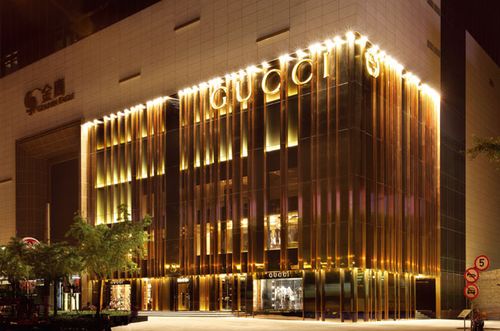
gucci

“Located in the heart of Shanghai adjacent to Plaza 66, the Shanghai Flagship reflects the company’s continued commitment to the Chinese luxury marketplace. With Giannini’s singular design, the store offers a powerful and personal affirmation of Gucci’s growing Asian presence, and symbolizes Gucci’s 21st century contemporary look.

Giannini’s innovative concept employs open space, warm luxurious materials and natural light, emphasized by a massive 19 x 43 meter golden glass façade, to spectacular effect. This external sheet of transparent glass spans all five stories, letting natural light pour through the space while allowing views both inside and out. A noteworthy design feature is the staircase with a stunning series of vertical gold and clear Plexiglas rods, that allow light to reflect in the space.”
http://www.gucci.com/ch/worldofgucci/articles/shanghai-flagship#3

意大利 Gucci上海旗舰店J


http://www.luxuo.com/wp-content/uploads/2009/06/guccishanghai.jpg
 
The who the very boss at top a shopping a gucci... that is woman  very top and boss form china.


I’d feel relaxed and calm and peaceful in there. I like the space. This is clear, clean space. It is tidy and shiny and beautiful, unlike Primark, where the clothes are on the floor and the customers are all squashed together.

Primark has loads and loads of clothes squashed together and piled up – all on top of each other and on rails. There are things shoved behind stairs and walls, and walls of clothes lined up and there is no order. Jewellery and accessories are on a stand  which you have to walk around to see  and they are close together so you have to weave in and out of them so you can’t see things clearly.
In Gucci there is presentation. Everything is clear to see. Accessories are displayed in glass cases so you can see every individual thing clearly.
Gucci looks like a living room with nice furniture which makes it feel relaxing. In Primark there is nothing to sit on ; it is cold and hard and plastic whereas Gucci is
warm, relaxing, comfortable and welcoming
Primark has racks of clothes close together whereas in Gucci mannequins are spaced out nicely. There are not reams and reams of clothes in one set area.
There are lots of mirrors – to encourage you to look at yourself in the clothes perhaps? This means you don’t have to queue with other people to look at yourself in something but can have space to try jackets on  etc. without being disturbed or crowded. There are lots of alcoves.

You wouldn’t get congestion of people in Gucci because it is huge and people can walk round freely without passing each other. There isn’t one set way of walking around the shop.

All the glass – 5 floors would be very expensive. The gold colour on the outside of the building  is linked to wealth and even without the Gucci label you would know it would be expensive. It looks really beautiful and I’d think wow it’s so luxurious.

The fact it is glass fronted means you could see people shopping and makes it contemporary. The lighting looks like flames going vertically up the wall and makes the shop front look warm and inviting.

The space – especially the reflection from the lighting of the glass at the front reminds me of the sparkle of Gucci accessories – like the crystals in the sunglasses and their jewellery.

This is like an art gallery but also like a shop. Everything is set out so you can see it clearly but it is a shop and it is probably set out in sections with accompanying jewellery and accessories.

Tuesday, 18 January 2011

Preeti S Kapoor

The magic of Sergei Diaghilev’s Ballet Russe…The enchanting tale pf Russian folklore…and the traditional ethereal juxtapose between endless snow and a vibrant costume tradition.
Russia, the land of foot tapping music and flowing ballet… The continent washed in vibrant colours that lend richness to the denizens of that continent. Preeti travels to Russia, bringing back with her some memorable cultural cameos that she adapts in her collection for Spring-Summer 2010.
Boho chic yet luxuriously dramatic, the summer for Preeti follows rich and bold iconography. Large paisleys, embroideries and rich fabrics like chiffon, satin and silks come together in feminine forms. Soft tunics with fitted shrugs, the sensual swish of chiffon blending with the drama of taffeta and satin and a fluid hemline to suit every moment.
Preeti’s colours are striking mixes with a classic palette of purple or inky blue and brown getting peppered with highlights of fruity colours like yellows, red and green.
The silhouettes follow sensual forms with fitted inclusions. Soft drape like dresses get coupled with well-tailored shrugs and jackets. India emerges in textural treats like a paisley motif resplendent with embroideries. Its Indo-Russian ballet for Preeti this summer.
http://fashiongear.fibre2fashion.com/promotions/wills-fashion-week-ss-10/preeti-kapoor.asp - 12/11/2011
 Strong cultural influenc
Very tailore
Strong Arabian Influences – colours  and silhouette
Asian influence – paisley pattern and colours – looks like fire.
Netting – 50’s influence to give structure to the dress.
Ballet of Cinderella influence.

Styling:
Make up and hair – Zorro and outlaws
Eyes - owl

Spanish tailoring.


Emotional affect on me– strong influence
Because she’s used strong colours and the design and tailoring
Like the mix of colours
And flow/ tailoring
Broad mix of influences
Makes you think of past, present and future.

Also because she’s an Asian woman – and reflects an Asian style – lots of gems, accessories, not dressed down – jeans and t-shirts.
Even under Burqha  - colourful clothing.


French swordsman – 3 Musketeers
Asian influence – paisley
Looks futuristic and like a strait jacket
Detailing and colour – gold etc – ornate – Asian – Indian.
The tassels  are like a weight that is used to fasten a sari and is also like what belly dancer’s wear which moves when they dance.


ballerina influence
Also like a rose – because of the colour also.
Less obviously Asian influenced and less ornate and detailed.
Shaped a little like a wedding dress – Western – volume


Definitely Indian – lots of detail – similar to the top 2. Ornate and detailed again
Mix of colours – modern and unlike a traditional sari

          5                                    6

5.Designer
Chinese look: shape, pattern and colours, shiny

6.African influence –detail at the bottom and top and the silhouette – like the women who wear turban like headdresses.  Detail is smaller and more in set areas.


Preeti S. Kapoor has lots of styles of clothing and lots of different influences from around the world. There are obvious similarities but some of her work does not follow the same look. Her style is subversive to the traditional Indian style for some of the clothes but others are more traditional . She shows both Hindu and Pakistani influences in her clothing.
Her target Audience is rich Asian women like Bollywood actresses and other famous people or creative people. The age range would probably be from 18-40 . It might not be liked by more traditional older people who might be more traditional and cover form head to toe and some of it might be too old for 18 year olds – too grown up.
She takes influences from a range of countries including Spain, Asia, Japan, China, Pakistan, Africa – a global influence. There is often a strong Indian influence with the patterns and colours and textures but there are some minimalistic  pieces too.